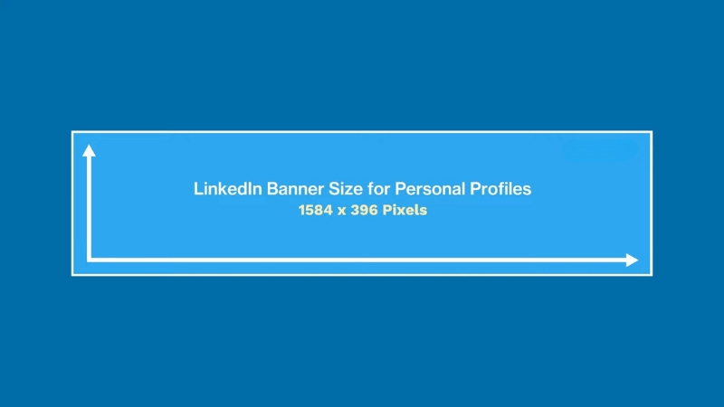
The correct LinkedIn banner size is 1584 × 396 pixels, with a 4:1 aspect ratio, optimized for desktop viewing and automatically scaled on mobile.
Using these dimensions prevents cropping, preserves text clarity, and ensures logos and brand elements remain visible across devices.
Anything smaller risks blur, and anything larger gets compressed or unpredictably cropped.
This article explains the exact dimensions, how LinkedIn displays banners on different screens, what areas are actually safe for content, and how to design banners that support branding without hurting profile readability or professionalism.
Official LinkedIn Banner Dimensions and Technical Specs
LinkedIn officially defines the personal profile banner as 1584 pixels wide and 396 pixels tall. This format has remained stable since LinkedIn’s major profile redesign rollout between 2020 and 2021, when banner visibility was increased to prioritize personal branding and professional positioning.
The platform compresses images aggressively, so starting with the correct size is not optional if clarity matters.
The file size limit is 8 MB, and LinkedIn accepts PNG, JPG, and GIF formats. PNG performs better for text-heavy banners because it handles sharp edges and contrast more cleanly, while JPG can introduce compression artifacts that soften text and logos.
GIF banners are technically supported, but animation does not autoplay consistently and often degrades perceived professionalism, so they are rarely used by serious brands or executives.
Attribute
Specification
Recommended size
1584 × 396 pixels
Aspect ratio
4:1
Maximum file size
8 MB
Supported formats
PNG, JPG, GIF
Color space
sRGB
Compression
Automatic, lossy
LinkedIn does not offer a separate banner size for mobile. Instead, it scales the same image, which creates the biggest design challenge because the visible area changes depending on screen width.
How LinkedIn Crops and Displays Banners on Different Devices
While the banner is uploaded as a single image, LinkedIn does not show the same crop on desktop and mobile. On desktop, the banner spans the full width of the profile header. On mobile, the left and right edges are trimmed, and vertical spacing shifts slightly due to UI overlays.
The profile photo partially overlaps the banner on the left side, covering roughly 15 to 20 percent of the banner’s height and width, depending on screen resolution.
This overlap is consistent across devices and is one of the most common causes of poorly placed text or logos.
Designing without accounting for this overlap leads to cut-off slogans, obscured brand marks, or unbalanced composition. Experienced designers treat the banner as a background-first canvas rather than a traditional header graphic.
Device
Effective safe width
Key risk areas
Desktop
~1350 px centered
Left overlap from profile photo
Mobile
~1100 px centered
Left and right edge cropping
Tablet
Varies
Mixed cropping behavior
The practical takeaway is simple. Any critical text, logos, or visual anchors must be placed in the center 60 percent of the banner and vertically aligned away from the bottom-left quadrant.
Safe Zones for Text, Logos, and Visual Elements
LinkedIn does not publish official safe zone guidelines, but repeated testing across devices reveals consistent behavior. The safest design area is horizontally centered and vertically aligned slightly above the midline.
Elements placed at too low a risk are covered by interface elements, while items placed too far left compete with the profile photo.
Professional designers often use invisible grid overlays during design to enforce spacing discipline. This matters more on LinkedIn than on most platforms because banners are not decorative. They directly support credibility, role clarity, and brand recall.
Element type
Best placement
Primary text
Centered, upper-middle
Logo
Center-right
Background imagery
Full width, low contrast
Decorative accents
Far edges only
Avoid placing phone numbers, URLs, or dense text anywhere on the banner. LinkedIn banners are not meant to function as advertisements or landing pages. Their role is contextual reinforcement, not conversion.
Banner Design Quality and Image Resolution Considerations
View this post on Instagram
LinkedIn compresses images after upload, which disproportionately affects banners with gradients, small text, or fine patterns. Starting with the correct pixel size is only part of the equation.
The visual density of the design matters just as much.
Text smaller than 36–40 pixels in height often becomes unreadable after compression, especially on mobile screens.
Thin fonts suffer more than bold or semi-bold typefaces. High-contrast color combinations perform better than subtle tones, particularly against photographic backgrounds.
For logos, vector-based exports converted to PNG retain sharpness better than raster logos saved at low resolution. This is especially important for personal brands that rely on wordmarks rather than symbols.
Common LinkedIn Banner Mistakes and Their Real Impact
The most frequent banner mistakes are not aesthetic but functional. Overcrowding the banner with claims, keywords, or services reduces clarity and weakens perceived expertise. LinkedIn profiles are scanned, and banners that require effort to interpret are ignored.
Another recurring error is designing banners inside generic social media templates intended for Twitter or YouTube headers.
These templates have different aspect ratios and safe zones, which leads to unpredictable cropping once uploaded to LinkedIn.
Finally, many users design banners in isolation without checking how they interact with the profile headline, name typography, and profile photo. The banner does not exist on its own. It is part of a fixed visual system that LinkedIn controls.
Mistake
Consequence
Text too close to edges
Cropping on mobile
Low contrast colors
Poor readability
Small fonts
Compression blur
Overloaded messaging
Reduced credibility
Ignoring profile photo overlap
Obscured content
Branding Strategy: What a LinkedIn Banner Should Actually Communicate
A LinkedIn banner should answer one question within two seconds: What context should I use to interpret this profile? That context may be a profession, industry, specialization, or point of view. Anything beyond that becomes noise.
For individuals, effective banners often reinforce role clarity, such as executive leadership, technical expertise, or industry focus. For companies, banners tend to emphasize positioning, scale, or trust signals rather than promotional language.
Unlike other platforms, LinkedIn penalizes visual exaggeration indirectly. Profiles with restrained, information-first banners are statistically more likely to be perceived as credible in recruiter and B2B evaluations, according to multiple UX audits conducted by recruitment platforms between 2022 and 2024.
Using Templates and Design Tools Without Breaking Technical Rules
Many users rely on online design tools to produce LinkedIn banners quickly. This approach is fine as long as the final export respects LinkedIn’s exact pixel dimensions and safe zones. The problem is not the tools but the misuse of default presets that prioritize aesthetics over platform behavior.
When using any template-based tool, always override the canvas size manually to 1584 × 396 pixels and verify element placement with a mock profile preview.
Templates labeled “LinkedIn banner” are often outdated or optimized for visual symmetry rather than real-world cropping.
This is where tools like a brochure maker become unexpectedly useful. Brochure layouts are designed around information hierarchy and spacing discipline, which translates well to LinkedIn banners when adapted to the correct aspect ratio. The key is controlling structure first, then visuals, not the other way around.
Examples of Effective LinkedIn Banner Use Cases
@theindependentconsultant Don’t underestimate the power of your #linkedin banner ✍🏼 #freelance #freelancetips #linkedintips #linkedintip #fyp #banner ♬ original sound
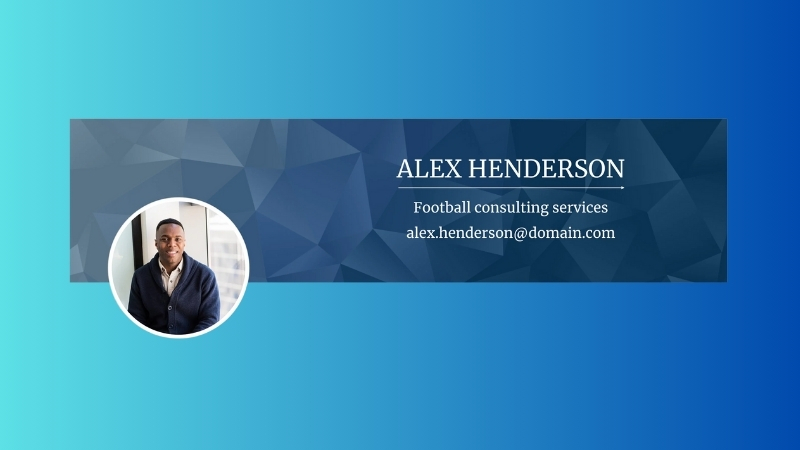
Executives frequently use minimalist banners with muted colors, a single positioning statement, and ample negative space. These banners perform well because they complement the profile headline rather than compete with it.
Consultants and freelancers often benefit from banners that visually frame their specialization, such as industry imagery or abstract patterns paired with a short descriptor. The most effective examples avoid listing services and instead reinforce category association.
Company pages typically use banners to establish scale or credibility, such as geographic presence, product ecosystem visuals, or customer segments. High-performing company banners rarely change. Consistency over time matters more than novelty.
Testing and Updating Your LinkedIn Banner Over Time
LinkedIn does not provide native banner analytics, but performance can be inferred indirectly through profile views, connection acceptance rates, and recruiter outreach frequency. Substantial banner changes should be followed by at least two to three weeks of observation before concluding.
Seasonal updates, role changes, or rebranding efforts justify banner updates. Frequent cosmetic changes do not. From a credibility standpoint, stability signals confidence and clarity.
Before finalizing any update, always review the banner on desktop and mobile. What looks balanced on a large screen can feel cramped on a phone. This final check prevents most avoidable mistakes.
Final Technical Checklist
Check
Status
Size exactly 1584 × 396 px
Required
File under 8 MB
Required
Text inside the center safe zone
Required
Profile photo overlap considered
Required
Readable on mobile
Required
Matches profile headline context
Required
A LinkedIn banner is not decoration. It is a structural context. When designed with the correct dimensions, safe zones, and informational restraint, it strengthens credibility rather than distracting from it.