If your Instagram Stories still look a little off – cropped weirdly, stretched, or fuzzy after upload – you’re not imagining things. Instagram quietly tweaks how it handles visuals every few updates, and what looked perfect last year can suddenly look amateurish today.
So let’s clear it up once and for all:
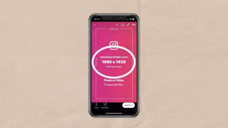
The best Instagram Story size in 2025 is 1080 × 1920 pixels, with an aspect ratio of 9:16.
That’s the standard vertical format that fills the entire screen of most smartphones without black borders or awkward zooming. But here’s the catch – not every phone displays your Story the same way, and Instagram’s compression can still ruin great visuals if you don’t plan around it.
Let’s go step by step through what really matters this year – dimensions, file type, placement, safe zones, and a few insider tricks that make your Stories look like they came from a pro.
The Perfect Instagram Story Size in 2025
Element
Recommended Specification
Why It Matters
Resolution
1080 × 1920 px
Full-screen clarity without compression
Aspect Ratio
9:16
Matches the default phone screen format
Minimum Size
600 × 1067 px
Avoid pixelation on slower uploads
File Type
JPG or PNG
PNG keeps text/logo edges sharp
Max File Size
~30 MB
Larger files compress heavily
Video Duration
1–15 seconds per clip
After 15 seconds, Instagram cuts or splits
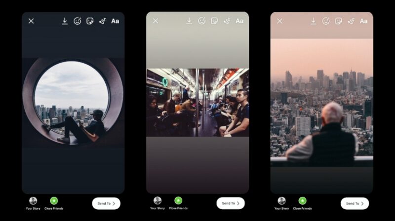
The 9:16 ratio is what Instagram was built on – but here’s what creators often miss: the safe zone for your text, stickers, and hashtags is smaller than the full frame.
The “Safe Zone”
View this post on Instagram
Ever notice how your captions or stickers sometimes get covered by the profile name or “Send Message” bar at the bottom? That’s because Instagram automatically overlays UI elements on top of your content.
To avoid this, imagine a margin of about 250 pixels at the top and 250 pixels at the bottom. Keep your text, logos, and faces inside the center 1420 pixels (roughly the middle two-thirds).
Safe Zone Breakdown
Area
Pixel Range
What to Avoid
Top 250 px
Profile picture & handle overlay
Avoid headlines or titles
Center 1420 px
Primary content zone
Keep main text and visuals here
Bottom 250 px
Buttons and message bar
Avoid subtitles or CTAs here
Think of it as your “Instagram Story stage.” Everything important should stay inside that frame.
How Instagram Handles Image and Video Compression
Instagram aggressively compresses uploads to keep file sizes small. Even a crisp DSLR photo can lose quality once uploaded. To minimize that:
That combo keeps things smooth while avoiding those weird pixelated blocks that show up after upload.
Real-World Tips That Make a Difference
1. Design with the Phone in Mind
Always preview your Stories on an actual phone before posting. Something that looks centered on your laptop might appear too low or high on a mobile screen.
2. Use Text Contrast Wisely
Instagram Stories are viewed fast – people swipe in seconds. If your background and text color blend, your message disappears. Add subtle overlays or shadows behind text to boost readability.
3. Stay Under 15 Seconds (Per Clip)
Even though Instagram can auto-split longer videos, it often creates tiny delays between segments. Trim clips to fit naturally within 15 seconds for smoother playback.
4. Try 4K Footage, Then Downscale
Shooting in 4K (2160 × 3840) and resizing to 1080 × 1920 gives sharper detail after compression – a trick used by professional social media teams.
5. Add Branding Smartly
Instead of stamping your logo in the corner, integrate it naturally – on a product, in motion graphics, or as a subtle watermark. It looks cleaner and avoids the “ad look.”
Common Mistakes That Ruin Great Stories
Mistake
What Happens
Easy Fix
Wrong ratio (e.g., 16:9 landscape)
Black bars appear
Crop or redesign to 9:16
Text too high/low
Covered by UI elements
Keep text in safe zone
Oversized uploads
Blurry after compression
Stick to 1080 × 1920 px
Low brightness
Looks dull on OLED screens
Slightly boost exposure before upload
Small corrections like these can instantly make your brand look more polished.
Should You Ever Use Other Sizes?
If you’re repurposing TikToks or Reels, you’re safe – those formats are also 9:16. But if you’re adapting landscape videos from YouTube or widescreen footage, you’ll need to crop or add background padding.
Some creators experiment with 1080 × 2340 px (a taller version) to fill extra space on phones with longer displays, but Instagram will still scale it down, so you gain no real advantage.
Stick to 1080 × 1920 for the best balance between flexibility and quality.
Final Thoughts
In 2025, vertical content isn’t just trendy – it’s the default. Whether you’re posting behind-the-scenes clips, branded promos, or casual updates, getting your Instagram Story dimensions right is what separates crisp, professional visuals from rushed uploads.
So remember:
Once you start designing with those details in mind, your Stories won’t just fit – they’ll flow. They’ll feel native to the platform, visually consistent, and polished enough to grab attention before anyone swipes away.