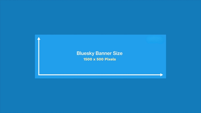
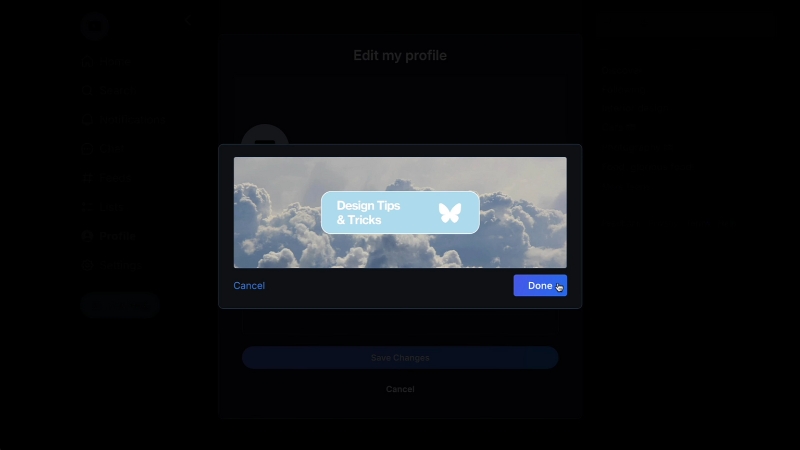
Best Bluesky banner size remains 1500 × 500 pixels, with an aspect ratio of 3:1.
This format works well on both desktop and mobile views and ensures that your entire image stays visible without awkward cropping.
Bluesky automatically scales images depending on device width, so using a large, balanced file keeps your banner crisp without stretching or distortion.
The Ideal Banner Size for Bluesky (2025)
Like most social platforms, Bluesky’s layout changes slightly depending on screen size. On large desktop monitors, the banner stretches fully across the profile; on mobile, it scales proportionally.
The layout flexibility works similarly to Discord Server banners, which also adjust automatically across devices to preserve clarity and proportion.
The safest banner size you can upload without losing quality or important content is 1500 × 500 pixels, keeping the 3:1 ratio intact.
Specification
Recommended Setting
Explanation
Banner Size (Standard)
1500 × 500 px
Fits perfectly on desktop and mobile without compression artifacts.
Aspect Ratio
3:1
Prevents stretching or cropping during auto-scaling.
File Format
PNG or JPEG
PNG for sharp text/logos; JPEG for photos or gradients.
Max File Size
2 MB
Ensures quick load times on all devices.
Color Profile
RGB
Matches display standards for digital screens.
Orientation
Landscape
Vertical or square images will be cropped automatically.
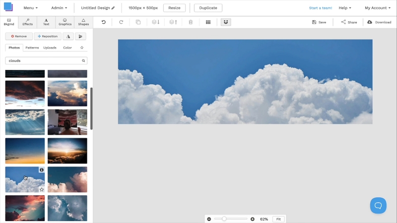
For best results, create and export your banner at exactly 1500 × 500 px. If you upload something larger, Bluesky compresses it to save bandwidth, which may soften colors or edges.
Safe Zones and Cropping Behavior
One of the most common mistakes users make is placing text or logos too close to the banner’s edges. Bluesky, like most social platforms, automatically crops a small portion of the sides and bottom on smaller screens.
Keeping key visual elements inside the central 1200 × 400 px area (the “safe zone”) ensures they stay visible on all devices.
Banner Section
Visibility
Recommendation
Top Edge
Always visible
Ideal for background textures or gradients only.
Bottom Edge
Partially cropped on mobile
Avoid placing text or faces here.
Left/Right Edges
May crop by 100–150 px
Keep logos and text centered horizontally.
Center Zone (Safe Area)
Fully visible on all devices
Place key content here for best visibility.
If you’re designing for branding, align your main text or logo toward the center-top region. Bluesky overlays your profile picture in the lower left corner of the banner, so avoid placing anything important behind that area.
Recommended File Formats and Compression Settings
Bluesky supports both JPEG (JPG) and PNG formats for banners, but each behaves slightly differently once uploaded. JPEGs are lighter and load faster, but may introduce slight compression artifacts in gradients or text.
PNGs preserve sharpness and color accuracy, making them ideal for banners that contain logos, icons, or typography.
Format
Ideal Use Case
Pros
Cons
JPEG
Photos, textures, or landscapes
Small file size, fast loading
Slightly reduced sharpness after compression
PNG
Logos, text-based banners
Crisp edges, no color loss
Larger file size
GIF (Not Supported)
N/A
N/A
Bluesky currently does not support animated banners
To maintain image clarity, export your banner at 72 DPI using the sRGB color profile. Avoid uploading CMYK or Adobe RGB files; they can appear dull or incorrectly tinted once rendered in-browser.
Design Guidelines for a Clean, Professional Look
A well-designed Bluesky banner feels balanced, not too busy, not too plain. The platform’s white and neutral gray interface makes bright or high-contrast banners stand out beautifully, but overdoing saturation can clash with the rest of the layout.
Design Element
Recommended Approach
Reason
Color Scheme
Medium contrast; muted or pastel tones
Works harmoniously with Bluesky’s light interface
Text Placement
Centered horizontally, slightly above center vertically
Keeps text clear and away from profile overlay
Font Choice
Sans-serif (e.g., Inter, Lato, Montserrat)
Matches the modern aesthetic of Bluesky
Image Focus
Minimal clutter; clear focal point
Prevents distraction from profile picture and header icons
Background Style
Soft gradients or subtle textures
Adds depth without overwhelming the interface
If your banner includes a photo, choose one with clean composition; empty space on one side is perfect for placing your logo or name. For creators, using a single high-quality portrait with a blurred background works well.
For brands, abstract shapes, gradients, or muted product shots tend to fit the Bluesky aesthetic best.
How to Create a Perfect Banner (Step-by-Step Workflow)
Designing an effective Bluesky banner doesn’t require expensive software. Even free tools like Canva, Photopea, or Figma can produce professional results when you stick to proper dimensions.
Step
Task
Purpose
1
Set your canvas size to 1500 × 500 px
Ensures exact fit for upload
2
Choose your background (solid, gradient, or image)
Defines your visual identity
3
Add logo, name, or tagline within the central 1200 × 400 px zone
Keeps content visible after cropping
4
Adjust contrast for readability
Makes text stand out in all lighting modes
5
Export as PNG under 2 MB
Preserves clarity with a manageable file size
6
Test on both desktop and mobile
Confirms correct scaling and placement
If you want your banner to stay timeless, aim for minimalism. The Bluesky community values authenticity and clarity, so designs overloaded with text or graphics tend to feel out of place.
Common Mistakes and How to Avoid Them
Even a good design can lose impact when formatted incorrectly. The most common issues involve sizing errors, poor color balance, and ignoring safe zones.
Mistake
Result
Solution
Using a square or portrait image
Cropped or stretched banner
Always resize to 1500 × 500 px
Placing text too close to the edges
Words cut off on mobile
Keep within safe zone (center 1200 × 400 px)
Over-saturated colors
Visual clash with Bluesky’s light UI
Use medium contrast tones
Heavy file size (over 2 MB)
Longer loading time, lower quality
Compress or export at a lower quality setting
Low-resolution uploads
Blurry banner on high-DPI screens
Export at full resolution before upload
If your banner looks pixelated after uploading, try reducing the file’s brightness or re-exporting as a PNG. Sometimes re-uploads with cleaner compression yield noticeably better results.
Banner Style Recommendations by User Type
Depending on your role or purpose on Bluesky, your banner should communicate something about your identity or tone. A personal account might use a landscape photo, while a company account benefits from clean branding and subtle gradients.
User Type
Visual Style
Recommended Design Approach
Personal Account
Natural, relaxed, authentic
Use landscape photos, soft lighting, and minimal text
Business / Brand
Clean, minimal, brand-colored
Include logo, slogan, and consistent brand colors
Creator / Artist
Expressive but polished
Showcase artwork or a pattern relevant to the niche
Media / News Outlet
Bold, readable, structured
Strong typography with background texture
Community / Nonprofit
Warm, inclusive, friendly
Use people or symbolic imagery that evokes purpose
If you’re managing a professional profile, consistency between your profile photo and banner is essential. Matching color palettes and typography builds trust and recognition instantly.
Optimizing for Mobile Users
In 2025, over 70% of Bluesky’s traffic comes from mobile devices, which means banners must be designed to adapt gracefully to smaller screens.
The platform’s mobile view compresses banner width by roughly 15%, slightly trimming the edges. This makes the central composition even more important.
Display Type
Width Retained
Cropping Behavior
Design Priority
Desktop (Full View)
100% width (1500 px)
Full banner visible
Balanced center composition
Mobile Landscape
~85% width (~1275 px)
Slight edge trimming
Keep focus centered
Mobile Portrait
~80% width (~1200 px)
Crop sides significantly
Avoid placing content near edges
Tablet
90–95% width
Minimal cropping
Similar to the desktop experience
Testing your design on both mobile and desktop before final upload ensures it remains readable and balanced in every layout.
Performance and File Optimization Tips
Even if your design looks perfect, large file sizes can cause slow loading on mobile networks. Bluesky automatically compresses anything above 2 MB, but that process can reduce clarity.
To avoid quality loss, manually export your file at optimal compression levels before uploading.
Export Setting
Recommended Value
Purpose
Resolution
1500 × 500 px
Native display resolution
Bitrate (for JPEG)
80–90% quality
Best balance between clarity and size
DPI
72
Standard for web graphics
Color Space
sRGB
Maintains consistent colors
File Size Goal
Under 2 MB
Prevents Bluesky’s auto-compression
Testing file clarity by zooming in 200% before upload is a quick way to catch artifacts early. If edges or gradients look rough, export again at a higher quality setting.
Final Thoughts
Your Bluesky banner is the visual anchor of your profile; it sets the tone before a single post is read. A sharp, well-balanced image communicates professionalism, care, and personality in seconds.
The formula isn’t complicated: start with 1500 × 500 pixels, keep your key elements within the central safe zone, use muted but consistent colors, and always test on both desktop and mobile.