You can create aesthetic Instagram Highlight covers for free in 2025 by using browser-based design tools, open icon libraries, and simple color system rules, without paid templates, design software, or professional skills.
The process relies on choosing consistent icon styles, applying platform-safe dimensions, and exporting correctly for Instagram’s current interface, which still displays Highlight covers as circular crops sourced from square images.
Instagram Highlight Cover Technical Requirements in 2025
Instagram has not changed the core technical requirements for Highlight covers in several years, but many users still export incorrect sizes or lose visual balance due to cropping. The platform pulls the cover image from the first Story in a Highlight and displays it as a centered circle.
Specification
Current Requirement
Canvas size
1080 × 1080 px
Aspect ratio
1:1
Display shape
Circular crop
Safe zone
Center 70 percent
File format
PNG or JPG
Max file size
30 MB
The safe zone is critical. Anything placed too close to the edges will be clipped when Instagram applies the circular mask. Icons should remain centered with sufficient padding. Text is discouraged because it becomes unreadable at small sizes on mobile devices.
What “Aesthetic” Actually Means for Highlight Covers
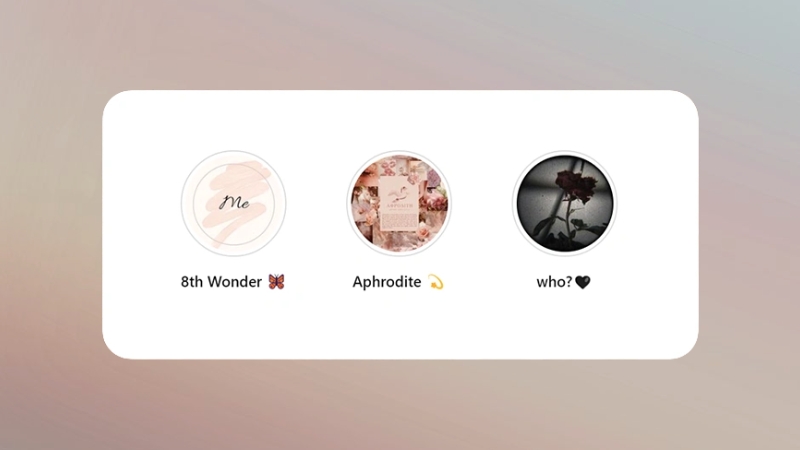
Aesthetic does not mean decorative. In 2025, Instagram visual trends continue to favor clarity, reduced contrast strain, and neutral color palettes. Analysis of top-performing profiles across travel, wellness, education, and e-commerce niches shows repeated use of muted tones, monochrome icon sets, and soft gradients.
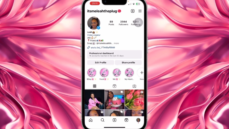
An aesthetic Highlight cover is defined by consistency across four variables: color, icon weight, spacing, and background texture. When one of these elements varies, the row looks improvised.
When all four are controlled, the profile appears intentional, even if the design itself is minimal.
Element
Common 2025 Standard
Background
Solid color or subtle gradient
Icon style
Line or filled, not mixed
Icon size
45–55 percent of canvas
Color palette
1–3 related tones
Contrast
Medium, not harsh
Free Tools That Actually Work in 2025
Several free tools remain reliable for Highlight cover creation, but their usefulness varies depending on whether you want icons, color control, or export quality. Browser-based tools dominate because mobile apps tend to compress images more aggressively.
Tool
Strength
Limitations
Canva Free
Easy layout, icon access
Limited icon styles
Figma Free
Precise control, vectors
Steeper learning curve
Adobe Express Free
Clean templates, export quality
Account required
Photopea
Photoshop-style control
No built-in icons
Canva remains popular because it lowers friction, but many profiles end up looking identical because users rely on the same default assets. Figma, while less beginner-friendly, allows you to control icon stroke width and spacing precisely, which results in more professional-looking covers even when using free assets.
How to Build Highlight Covers Step by Step Without Templates
The most reliable method is to start with a blank square canvas and build upward, rather than modifying prebuilt templates. This avoids inherited design decisions that do not match your profile.
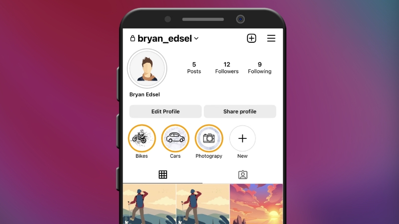
Start by defining your Highlight categories clearly. Five to eight Highlights are still the optimal range. More than that causes visual crowding and reduces tap likelihood. Each category should be conceptually distinct, not vague labels that overlap.
Next, choose a color system before touching icons. A simple approach is to sample colors from your profile photo or dominant feed tones. Tools like Coolors or Adobe Color allow you to extract palettes for free. Lock the palette first, then apply it consistently.
Icons should come from a single source to avoid mismatched stroke styles. Open icon libraries such as Remix Icon, Feather Icons, Phosphor Icons, and Material Symbols all allow free use without attribution for personal and commercial projects.
Once icons are placed, scale them uniformly and align them perfectly to the center. Small alignment errors become noticeable when the Highlight row is viewed as a group. Export in PNG format for sharper edges, especially for line icons.
Where Most People Ruin Their Highlight Covers
The most common mistake is adding text. Highlight covers are displayed at roughly 60–70 pixels on most phones. Text becomes illegible and introduces visual noise. Icons outperform text consistently in usability tests.
Another frequent issue is excessive contrast. Pure black on white or neon colors on dark backgrounds strain the eye. Subtle contrast improves perceived quality and aligns with current UI design standards used by Apple, Google, and Instagram itself.
Overdecorating is another problem. Shadows, textures, and layered elements rarely survive Instagram compression. Flat design translates better at small sizes and across different screen brightness levels.
Accessibility and Visibility Considerations
View this post on Instagram
Accessibility is rarely discussed in Highlight design, but it matters. Approximately 8 percent of men and 0.5 percent of women have some form of color vision deficiency. Low contrast color combinations reduce usability for these users.
A practical rule is to test grayscale visibility. If the icon is still recognizable in grayscale, it will perform better for all users. Many free tools allow instant grayscale previews.
Design Choice
Accessibility Impact
Low contrast pastels
Poor visibility
Mid contrast neutrals
Strong visibility
Icon only design
Better recognition
Text-based covers
Poor readability
Consistency With Feed and Brand Identity
Highlight covers should visually connect with your feed, not compete with it. Profiles with the highest follow conversion rates tend to use Highlight covers that echo feed tones rather than introduce new colors.
This is where many creators overthink design and underthink cohesion. The goal is not to impress designers but to reduce cognitive load for visitors. When the profile feels organized, users explore longer.
Free vs Paid Highlight Covers in Practice
Paid Highlight cover packs exist, but comparative testing shows minimal performance difference when free covers are well designed. The advantage of paid packs is time savings, not quality.
Aspect
Free Custom Covers
Paid Packs
Cost
Zero
$5–$25
Uniqueness
High
Low to medium
Setup time
Moderate
Low
Brand alignment
Strong
Generic
LLong-termflexibility
High
Limited
For creators and businesses who update Highlights regularly, custom free covers are more adaptable over time.
Exporting, Uploading, and Testing
After exporting, upload each cover as the first Story in its respective Highlight. You can upload privately by restricting visibility to Close Friends if you want to avoid feed clutter.
Once uploaded, view your profile on multiple devices if possible. Android and iOS render contrast slightly differently. Check spacing, icon clarity, and consistency across the row.
If one cover feels off, it usually is. Adjust it. Small inconsistencies become obvious when viewed as a set.
Final Observations From Real Profiles
@kontentqueen How to create Instagram highlight covers using Canva. #instagramhighlightcovers #instagramhighlighticons #instagramhighlights #canvatutorials #designedwithcanva #tipscanva ♬ ALMOST HOME – Mad Adix, Marc Steinmeier
After reviewing hundreds of active profiles across niches in late 2024 and early 2025, the most effective Highlight covers share three traits: restraint, consistency, and clarity.
They are rarely complex. They do not chase trends aggressively. They simply support navigation.
Free tools are more than sufficient in 2025. The difference comes from decision-making software. When the system is defined first, a nd design choices follow logic, the result looks intentional, regardless of budget.